So this is probably the most common thing that people ask for. As for the answer? Well I'm not sure. I guess that there is a simple way to find out and that would be based on type of camera (point-and-shoot, bridge camera or DSLR).
Most of us know what a point-and-shoot camera is and most of us have owned them. I used to have a Casio Exilim which was a great wee thing that went round the world with me and even survived a whole year in Australia. It's about 8 years old now and is currently still going strong in the hands of a relative.
These cameras are now quite decent and there are not much difference between any of them except the usual - price and size. I've also got a Panasonic Lumix DMC-TZ8 which has since been spuerceeded by the TZ10, TZ20 and TZ30. If you've got slightly bigger pockets (both financially and literally) I would suggest the TX30 as it's not too big but a bit chunkier than most of it's relatives however it's got fantastic zoom and takes brilliant shots. A great thing to take on holiday or a night out I think.
I don't really know that much more about point-and-shoots as I didn't get into photography until I got my first DSLR. So if you were interested in taking photos as a hobby and you want something more substantial than a point-and-shoot then you need to have a serious think about what is best for you.
It comes down to bridge vs DSLR at this point. A bridge camera is something that "bridges" the gap between point-and-shoot and DSLR cameras. They don't have interchangeable lenses (although there is now a range called Micro Four/Thirds which do and and an extra dimension this area of photography).
So what's the point of a bridge camera? I suppose it's a decent things to have if you are not really that interested in changing lenses but want something that takes a better shot than your average point-and-shoot. These don't take quite as good pictures as DSLRs but are very versatile and some of them have tremendous zooms or "super-zooms" which are often better than most high end zoom lenses for DSLR. The quality of the picture might not be outstanding but if you were going on a safari, for example, and you didn't know much about photography then something like this would be ideal.
These cameras fall down in two area. Firstly, they are not very good in the dark. They are designed to do so many things that they are not perfect at anything and the lens that is fitted usually has a small maximum aperture e.g f5.6 or f7 which means that the whole the light goes through is quite small. The result of this is that the lens is noyt very "fast" and so is prone to camera shake during low light conditions. Also this has a knock on effect that you often have to use the flash which is usually built-in and so also not particularly good.
This issue with the small aperture also leads to another issue with these cameras. One of the most pleasing parts of a professional photograph is the "background blur". This is created by the light bending onto the sensor and really is only influenced by the aperture. The bigger the aperture (counter-intuitively, the lower f-number) the more blur is created. There is a post about depth-of-field (DOF) earlier in the blog which you can read to get you up to speed on this.
Consequently, these bridge cameras don't have as good a background blur as the DSLRs do. So if you are after something a bit more versatile and you think that you might be pursuing photography as a bit more than an occasional hobby then perhaps DSLR is what you should be looking at.
There are loads of these to choose from and it can be a bit of a minefield. I think the most useful thing I could tell you would be to take a look at either Canon or Nikon (sorry to all the Pentax / Sony users out there). Simply speaking these two are the biggest producers of DSLRs and their appropriate lenses so you have more options available with these two companies.
Entry level wise, there are plenty of options and I would suggest picking what you can afford and then going to Jessops and putting them in your hand and seeing which feels right. The body is not that important to begin with and in fact the lenses are more important. Most come with a 18-55mm kit lens and these are crap. If you can stretch to it then get something with a bit more versatility like 18-105mm and also get yourself a 50mm f1.8 which is the cheapest but one of the best lenses on the market. This will take brilliant portraits regardless of the camera body you are using.
I would also suggest that once you have found the camera body for you then try to stretch to the one above that. It's not that big a deal but for a little bit more money you might get something that's a bit more durable, has a few more features and it probably going to last you a bit longer before you have to upgrade to some else.
That's just a few thoughts that might help you decide. If you want my honest opinion as to what you should buy then get this...
http://www.wexphotographic.com/buy-nikon-d5100-digital-slr-with-18-55mm-vr-lens/p1525134
or this...
http://www.wexphotographic.com/buy-canon-eos-600d-digital-slr-camera-with-18-55mm-is-ii-lens/p1523926
Hope that's of use.
Z
Friday, August 24, 2012
Monday, August 20, 2012
Landscape Layers
Today on the Scottish Photography Community Facebook page there was some chat about how to fix an image where the sky was too dark after a grad had been overly used on the sky. There are several ways to do this and one of the topics that came up was layers and layer masks. Someone wanted to know how to do this so here goes (bare in mind this was a rush job that I only spent 10 mins on!)
 This is the original shot out of camera. It was taken last month in the Glen Coe valley looking west towards Glen Coe Village. As you can see the sky is a bit too bright and the foreground is a bit dark. Although the previous paragraph was about a sky that was too dark, the principles here can be applied to that also.
 So what I've done here is open up the RAW file and ignored the sky and processed it just paying attention to the grass and the rocks. You can see that lightening them has really screwed up the sky and there is blown highlights all over the place. Not to worry, as I'm not interested in the sky in this shot. The file was then saved like this.
 Next, I opened the original shot again and processed it specifically to get a sky that I was happy with. This is the result and the image again saved as a new file.
 This is the final image and it was crated using a "layer mask" in Photoshop. Basically you open the "sky" image and the "foreground" image then copy and paste one on top of the other. Then you create a layer mask on the top image. To do this make sure the top image is the one highlighted on the panel on the right and goto Layer --> Layer Mask --> Reveal All. You will see that a white panel has appeared next to the photo in the panel on the bottom right. Select a black paintbrush and start to paint over the parts of the picture that you want to "rub out".
Unlike an eraser, the picture is still there and if you make a mistake you can paint it back in by using a white paint brush. As they say "white reveals, black conceals". It takes a bit of time to get decent at this and also figuring out which layers need to be on top etc. Just play about with it and soon you will see that you can have all kinds of layers and layer masks in a single picture which really makes for some interesting results. Good luck. Z


Unlike an eraser, the picture is still there and if you make a mistake you can paint it back in by using a white paint brush. As they say "white reveals, black conceals". It takes a bit of time to get decent at this and also figuring out which layers need to be on top etc. Just play about with it and soon you will see that you can have all kinds of layers and layer masks in a single picture which really makes for some interesting results. Good luck. Z
HDR Made Simple

My shot comprised of three shots at -2, 0 and +2 exposure values pointing straight forward then the same again at 45 degrees then finally another 3 shots with the camera pointing straight up. Each of the nine shots was then individually manipulated in Light Room. These were exported as JPEGs (sorry Farbspiel but have never got my head around TIFFs) and then each group of three was imported into Photomatix. The HDR for each section was then created resulting in 3 HDR pictures - one for the bottom, one for the middle and one for the top of the vertoram (which is essentially a vertical panorama).
The three HDR shots were then opened with Photoshop's Photomerge panorama menu which is found under the tabs --> New --> Photomerge panorama. This was set to "auto" mode and the program plays around with the three pictures and lines them up appropriately to make the final vertorama.
A few more tweaks were added in Photoshop like a bit of contrast and some levels work and finally the image layers were flattened and it was added to a black background etc. This is the result and while it's quite a cool effect but very time consuming. If this was my full time job then I could understand the necessity for this level of input but as this kind of photography for me is more of a hobby for me I simply can't justify the work required for this result.
So what is the solution for this? Surely there must be an easier way to produce something like this? Ok, I realise that any short-cut method to do this might not stand up to much scrutiny but still if it's just for fits and giggles then I don't suppose it really matters that much.

Next I opened Topaz Adjust in Photoshop and used the HDR filter with the "dynamic pop" selected. I adjusted the sliders for adaptive exposure and for colour / saturation and clicked "ok". 6 minutes!
Finally I added the border, the watermark and overlaid the text at the top. Total time - 7 minutes. Not bad and you can be the judge of the result. Frankly, I think that it seems to be almost the same as the one at the top. In fact, I might actually prefer it. I certainly like how little time it took to do this in comparison to the first shot which was about an hour's work. It just goes to show how easy it is to do this kind of thing now and all off these effects are very accessible to everyone.
At this point I could have a gripe about how hard it would be to make a living being a photographer mainly due to the fact that everyone has a camera nowadays and often a very good one. When people see a painting that they like they will ask the artist, "How much is that?" but when they see a photo they like they ask, "How did you do that?"
As I said, I could have a gripe... but I won't. :p
Wednesday, August 15, 2012
Fireworks

Fireworks are a bit of a nuisance to shoot. There are several ways to do it and I think I've tried them all. Mostly it's a bit hit or miss.
The easiest and more reliable way I've found is this...
1. Make sure you are far enough away to fit the fireworks in the frame. For the ones at the Festival, the Crags is probably a good site.
2. Tripod, tripod, tripod. No exceptions.
3. Remote control helps so that you don't have to touch the camera.
4. Lock the ISO to 200 or less and DON'T leave it on auto.
5. Use shutter speed priority and scroll to about 3 - 5 seconds.
6. This lets the camera choose the aperture.
7. Manually focus on the Castle and leave the auto focus off as it gets confused in the dark.
8. Compose the shot ie Castle at the bottom of the frame. Portrait orientation is often better than landscape for fireworks. It's really just one of those things that you have to try out loads of times and see what works for you. I've even heard of people doing a 30second exposure and holding a black bit of card infront of the lens that they move out the way every time a firework goes off! Good luck Steve!
Sunday, August 12, 2012
The Gingerbread House
Over the last few months I was in a bit of a funk about photography. My enthusiasm was pretty low and I didn't really know how to raise it again. So I decided that perhaps it wasn't the photography that I was bored with, but the processing. My use of photoshop / lightroom etc was pretty basic and I thought I should have a look at what I could do in post processing and see if that would pique my interest again.
Sure enough, it seemed that I was only scratching the surface of processing. The website www.500px.com was a great inspiration regarding this as a lot of the photos on that site a beautifully processed. I realise that the original shots are also excellent but the folk on that site seem to have an amazing ability to tweak every last ounce of that "something special" from their shots.
So I decided to look into doing some more processed images. Ok, so I know that what I've been doing has been a bit over-done but I'm still at the beginning of learning how to get the most out of the software so gimmie some slack ;)
 Anyway, this is a shot of the "Ginger Bread House" at the East end of Princes St Gardens in Edinburgh. It's quite a nice picture and that house if very photogenic. I've photographed this a few times and it always comes out beautifully. In it's own right it's a decent photo. I like the vignette (naturally created by using the lens at it's maximum aperture) and the leading line of the path draws you into the image. Apart from a crop, I've not really done much else to this picture.
 Next I opened up Topaz Adjust in Photoshop and used it's stylized presets, one of which is called "Faded Glory". I tweaked the settings slightly to get it looking a bit like a painting. Next I used a layer mask with a white background and and painted out some of the edges to cut into the picture a little bit.
 Then I used a water-colour effect to make the picture even more like a painting. You can now see why I painted out some of the picture in the last shot. The water-colour filter seems to completely blot out the white parts and that gives a nice irregular outline.
 This is the final image. It's been finished off with a border that I've layered underneath the picture so that it looks like the "paining" is on top. That was the reason for painting out the edges in white allowing this effect. Also I've watermarked it with the "ZK" square and also overlaid a bit of text over the upper part of the image for the title.
All in all I think it works quite well and it just goes to show you what you can do with a bit of time, some Photoshop effects and layers. It's actually quite simple and it's worth trying as it really has given me some more enthusiasm for photography again. Long may it last :p Z
Sure enough, it seemed that I was only scratching the surface of processing. The website www.500px.com was a great inspiration regarding this as a lot of the photos on that site a beautifully processed. I realise that the original shots are also excellent but the folk on that site seem to have an amazing ability to tweak every last ounce of that "something special" from their shots.
So I decided to look into doing some more processed images. Ok, so I know that what I've been doing has been a bit over-done but I'm still at the beginning of learning how to get the most out of the software so gimmie some slack ;)


All in all I think it works quite well and it just goes to show you what you can do with a bit of time, some Photoshop effects and layers. It's actually quite simple and it's worth trying as it really has given me some more enthusiasm for photography again. Long may it last :p Z
Wednesday, August 1, 2012
Layers


Wednesday, July 25, 2012
HDR?

So how did I do this shot? Well to be honest it was quite easy. First it's worth knowing that architecture and industrial things look best in HDR (in my opinion). I took this picture at the harbour in Kirkwall on Orkney.
I opened the picture in Photoshop elements (I'm currently using version 10). Once I'd done that then I went to my filter list and opened up Topaz Adjust which is a set of "plug-ins".
Then I used the HDR set of filters and tweaked some of the colour settings and added a vignette. Back in Photoshop I cropped the picture and cloned out some of the lamp posts and people with a few strokes of the Heal Brush. I reduced the noise and then finally added the watermark on the warehouse in the back right of the picture using a new layer and the distort tool.

Z.
Tuesday, July 3, 2012
Loup of Fintry
Recently, I was up near Fintry doing a photoshoot for a friend of mine who is starting a new brewery which you can read about soon at http://www.fallenbrewing.co.uk/ Please note that you can click on each picture to see a larger view.
 When I was up there I couldn't help taking a shot of the waterfalls at the Loup of Fintry which I then posted online. A friend of mine has recently purchased Adobe Lightroom and was asking how I did this shot - so here goes Sam. Yes it looks totally fake and over processed but it's a bit different and is easily achieved with a few lightroom tweaks so here goes...
 This is the original shot straight out of camera. You can see that the view was pretty amazing. I had the camera on a tripod and had the f-number at f22 which allowed a long exposure of 1/4sec which was long enough to allow some movement in the waterfalls. It's not a bad shot but the sky was very bright so I had to underexpose the shot a bit to retain detail in the sky and the water. This means that the foreground is quite dark which we will fix as we go along.
 CROP
CROP
So from the first shot I cropped and straightened the image a bit. It is a small change but I think it lends something to the shot and makes the waterfall more of a feature than the sky. Note the tree in the upper left and that I didn't crop it out of the picture.
 CLARITY +100
This is perhaps the most crazy change to the picture. Pushing up the clarity gives almost an unreal feel to the shot and it's almost like an HDR picture at this point. Overuse of clarity is not usually a good idea because of this but for this landscape I wanted it to look over-done and excess clarity is a good place to start.
 VIBRANCY +50 SATURATION +15
This is where I added a bit of colour to the shot. I think that vibrance is a bit more subtle and saturation can be very very wild is overused. But again, this shot was something I was going for with this image so I pushed both sliders up quite far.
 LIGHTS +20 SHADOWS -15
As I said earlier, the picture was quite dark to retain some of the highlights in the sky and water. The "Lights" slider brings back some brightness to the picture. Decreasing the shadows slightly adds a bit of contrast but this has the knock-on effect of darkening the picture again so this has to be countered which we will do next.
 EXPOSURE +15 VIGNETTE -10
To brighten the image I increased the exposure to the point where I was almost losing the highlights again. Beware of the exposure slider though as it has a blanket effect on the whole image and can cause problems. With this image a bit brighter I then added a slight vignette which helps to draw the eye into the photo.
 PHOTOSHOP TWEAKS
Finally I put this back into Photoshop. I do like Lightroom and it does have a brush that you can use for local effects but I'm so used to the dodge and burn tools in Photoshop that I often go back to this and do some final processing to complete the shot. Here, I've added an additional bit of brightness and then painted in a bit more highlights in the the waterfall and the surrounding grass and rocks. Then I painted some more shadow back into the sky and then voila, the picture is finished. Hope you like it Sam!


So from the first shot I cropped and straightened the image a bit. It is a small change but I think it lends something to the shot and makes the waterfall more of a feature than the sky. Note the tree in the upper left and that I didn't crop it out of the picture.

This is perhaps the most crazy change to the picture. Pushing up the clarity gives almost an unreal feel to the shot and it's almost like an HDR picture at this point. Overuse of clarity is not usually a good idea because of this but for this landscape I wanted it to look over-done and excess clarity is a good place to start.

This is where I added a bit of colour to the shot. I think that vibrance is a bit more subtle and saturation can be very very wild is overused. But again, this shot was something I was going for with this image so I pushed both sliders up quite far.

As I said earlier, the picture was quite dark to retain some of the highlights in the sky and water. The "Lights" slider brings back some brightness to the picture. Decreasing the shadows slightly adds a bit of contrast but this has the knock-on effect of darkening the picture again so this has to be countered which we will do next.

To brighten the image I increased the exposure to the point where I was almost losing the highlights again. Beware of the exposure slider though as it has a blanket effect on the whole image and can cause problems. With this image a bit brighter I then added a slight vignette which helps to draw the eye into the photo.

Finally I put this back into Photoshop. I do like Lightroom and it does have a brush that you can use for local effects but I'm so used to the dodge and burn tools in Photoshop that I often go back to this and do some final processing to complete the shot. Here, I've added an additional bit of brightness and then painted in a bit more highlights in the the waterfall and the surrounding grass and rocks. Then I painted some more shadow back into the sky and then voila, the picture is finished. Hope you like it Sam!
Saturday, June 23, 2012
Spot the Difference!
I was recently looking through some pictures from last year and I wondered what some of them would look like if I re-processed them from scratch without the previous final image for comparison.
I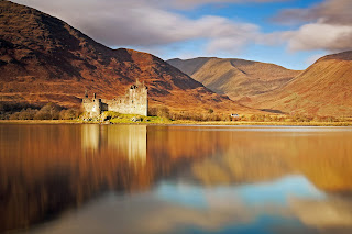 So this is the original final image of Kilchurn Castle up in the North West of Scotland on the banks of Loch Awe. It's a lovely site but I actually found it quite hard to negotiate a good shot of the castle. The spit of land that the castle is on is very narrow so doesn't really afford you a good angle. Also it was locked so I couldn't get inside to try something from there. Ended up on the opposite bank wading through about 500m of marsh land to get to where I took this picture from.
Anyway, it was evening and the colours of the light and the surrounding countryside were quite orange and brown. This cast onto the castle and confused the white balance and actually it was quite difficult to make the castle stand out so there was a fair amount of over-processing done and a lot of dodge/burn (a very valuable tool which I should post about some day).
The final shot is not bad but now looking back at it I think that it's a bit false-looking and quite surreal. The trick is to be either super-processed where it's obvious that your going for a stylized look OR to be subtle so that the viewer doesn't really notice it. I think that this shot falls somewhere in the middle and on retrospect doesn't do the scene justice.
So this is the original final image of Kilchurn Castle up in the North West of Scotland on the banks of Loch Awe. It's a lovely site but I actually found it quite hard to negotiate a good shot of the castle. The spit of land that the castle is on is very narrow so doesn't really afford you a good angle. Also it was locked so I couldn't get inside to try something from there. Ended up on the opposite bank wading through about 500m of marsh land to get to where I took this picture from.
Anyway, it was evening and the colours of the light and the surrounding countryside were quite orange and brown. This cast onto the castle and confused the white balance and actually it was quite difficult to make the castle stand out so there was a fair amount of over-processing done and a lot of dodge/burn (a very valuable tool which I should post about some day).
The final shot is not bad but now looking back at it I think that it's a bit false-looking and quite surreal. The trick is to be either super-processed where it's obvious that your going for a stylized look OR to be subtle so that the viewer doesn't really notice it. I think that this shot falls somewhere in the middle and on retrospect doesn't do the scene justice.
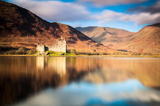 So with a fresh pair of eyes and a few months more experience it's interesting how the result has evolved. There's not a great deal of difference but I think it has a more natural feel to it. The castle certainly is less harsh looking and stands out more from the surrounding water and hillside. There is also a smoother overall finish to the whole shot. Interestingly, I removed the house to the right of the castle which I left in on the first shot but conversely left in the pylons which I did consider cloning out but felt they are a part of the Scottish countryside nowadays so left them in. The blacks in the hills are a bit blacker and the whites of the clouds (especially in the water) are a bit whiter and the blues in the sky/water are richer.
I like it. Yes, I think I like it quite a bit more than the original so all in all a worth while experiment.
At this point I would like to say again - YOU MUST SHOOT IN RAW!!! There is so much information hidden away in a RAW file that you can go back to it over and over again and reprocess it a million different ways to a level that a JPEG just can't compete with. It's also worth saying that the software for this moves on at almost a monthly rate so when I first processed this I was using Adobe Lightroom 3.0 (which then became 3.1 then 3.2) and now I'm using Lightroom 4 (well actually 4.1) and with each upgrade the possibilities increase and the quality of the result improves. Therefore it's always good to go back and have another look at older shots. This also gives you something to do when you're having a summer like we are right now - rain rain rain.
So with a fresh pair of eyes and a few months more experience it's interesting how the result has evolved. There's not a great deal of difference but I think it has a more natural feel to it. The castle certainly is less harsh looking and stands out more from the surrounding water and hillside. There is also a smoother overall finish to the whole shot. Interestingly, I removed the house to the right of the castle which I left in on the first shot but conversely left in the pylons which I did consider cloning out but felt they are a part of the Scottish countryside nowadays so left them in. The blacks in the hills are a bit blacker and the whites of the clouds (especially in the water) are a bit whiter and the blues in the sky/water are richer.
I like it. Yes, I think I like it quite a bit more than the original so all in all a worth while experiment.
At this point I would like to say again - YOU MUST SHOOT IN RAW!!! There is so much information hidden away in a RAW file that you can go back to it over and over again and reprocess it a million different ways to a level that a JPEG just can't compete with. It's also worth saying that the software for this moves on at almost a monthly rate so when I first processed this I was using Adobe Lightroom 3.0 (which then became 3.1 then 3.2) and now I'm using Lightroom 4 (well actually 4.1) and with each upgrade the possibilities increase and the quality of the result improves. Therefore it's always good to go back and have another look at older shots. This also gives you something to do when you're having a summer like we are right now - rain rain rain.
 So this is the original final image of Kilchurn Castle up in the North West of Scotland on the banks of Loch Awe. It's a lovely site but I actually found it quite hard to negotiate a good shot of the castle. The spit of land that the castle is on is very narrow so doesn't really afford you a good angle. Also it was locked so I couldn't get inside to try something from there. Ended up on the opposite bank wading through about 500m of marsh land to get to where I took this picture from.
Anyway, it was evening and the colours of the light and the surrounding countryside were quite orange and brown. This cast onto the castle and confused the white balance and actually it was quite difficult to make the castle stand out so there was a fair amount of over-processing done and a lot of dodge/burn (a very valuable tool which I should post about some day).
The final shot is not bad but now looking back at it I think that it's a bit false-looking and quite surreal. The trick is to be either super-processed where it's obvious that your going for a stylized look OR to be subtle so that the viewer doesn't really notice it. I think that this shot falls somewhere in the middle and on retrospect doesn't do the scene justice.
So this is the original final image of Kilchurn Castle up in the North West of Scotland on the banks of Loch Awe. It's a lovely site but I actually found it quite hard to negotiate a good shot of the castle. The spit of land that the castle is on is very narrow so doesn't really afford you a good angle. Also it was locked so I couldn't get inside to try something from there. Ended up on the opposite bank wading through about 500m of marsh land to get to where I took this picture from.
Anyway, it was evening and the colours of the light and the surrounding countryside were quite orange and brown. This cast onto the castle and confused the white balance and actually it was quite difficult to make the castle stand out so there was a fair amount of over-processing done and a lot of dodge/burn (a very valuable tool which I should post about some day).
The final shot is not bad but now looking back at it I think that it's a bit false-looking and quite surreal. The trick is to be either super-processed where it's obvious that your going for a stylized look OR to be subtle so that the viewer doesn't really notice it. I think that this shot falls somewhere in the middle and on retrospect doesn't do the scene justice.
 So with a fresh pair of eyes and a few months more experience it's interesting how the result has evolved. There's not a great deal of difference but I think it has a more natural feel to it. The castle certainly is less harsh looking and stands out more from the surrounding water and hillside. There is also a smoother overall finish to the whole shot. Interestingly, I removed the house to the right of the castle which I left in on the first shot but conversely left in the pylons which I did consider cloning out but felt they are a part of the Scottish countryside nowadays so left them in. The blacks in the hills are a bit blacker and the whites of the clouds (especially in the water) are a bit whiter and the blues in the sky/water are richer.
I like it. Yes, I think I like it quite a bit more than the original so all in all a worth while experiment.
At this point I would like to say again - YOU MUST SHOOT IN RAW!!! There is so much information hidden away in a RAW file that you can go back to it over and over again and reprocess it a million different ways to a level that a JPEG just can't compete with. It's also worth saying that the software for this moves on at almost a monthly rate so when I first processed this I was using Adobe Lightroom 3.0 (which then became 3.1 then 3.2) and now I'm using Lightroom 4 (well actually 4.1) and with each upgrade the possibilities increase and the quality of the result improves. Therefore it's always good to go back and have another look at older shots. This also gives you something to do when you're having a summer like we are right now - rain rain rain.
So with a fresh pair of eyes and a few months more experience it's interesting how the result has evolved. There's not a great deal of difference but I think it has a more natural feel to it. The castle certainly is less harsh looking and stands out more from the surrounding water and hillside. There is also a smoother overall finish to the whole shot. Interestingly, I removed the house to the right of the castle which I left in on the first shot but conversely left in the pylons which I did consider cloning out but felt they are a part of the Scottish countryside nowadays so left them in. The blacks in the hills are a bit blacker and the whites of the clouds (especially in the water) are a bit whiter and the blues in the sky/water are richer.
I like it. Yes, I think I like it quite a bit more than the original so all in all a worth while experiment.
At this point I would like to say again - YOU MUST SHOOT IN RAW!!! There is so much information hidden away in a RAW file that you can go back to it over and over again and reprocess it a million different ways to a level that a JPEG just can't compete with. It's also worth saying that the software for this moves on at almost a monthly rate so when I first processed this I was using Adobe Lightroom 3.0 (which then became 3.1 then 3.2) and now I'm using Lightroom 4 (well actually 4.1) and with each upgrade the possibilities increase and the quality of the result improves. Therefore it's always good to go back and have another look at older shots. This also gives you something to do when you're having a summer like we are right now - rain rain rain.
Panning
 Panning is something that a lot of sports shots incorporate. It's a way of taking a shot that lends motion to the picture. This shot shows an Aston Martin racing round Knockhill Race Track. I say "racing" but actually my Dad was driving and it was more like he was driving Miss Daisy.
Anyway, even though he was driving really slowly there is still some motion blur in the background. It's quite easy to achieve the blur but the real trick is keeping the car in focus. So how is it done?
Well much like the wildlife shots, I use servo / continuous focus so that the car stays in focus. Then you have to slow your shutter speed down to about 1/50th second. Next you have to have steady hands and keep a point of focus like the grill or the wheel. Your camera should be on continuous fire and as the car goes past try and keep the view finder on the same point of the car then press the shutter. Keep the button pressed until the car has gone past and you will have taken 7 or 8 shots in a row and hopefully one of them is in focus enough to use.
This technique takes a lot of practice as it's really hard to get the car sharp so you might have to have several attempts. Dad went round the track several times and of the 50 or so shots I took only one or two were of any use. Of course, he'll say that it was because he was driving so fast. Well thanks to this technique it looks like he was!
Panning is something that a lot of sports shots incorporate. It's a way of taking a shot that lends motion to the picture. This shot shows an Aston Martin racing round Knockhill Race Track. I say "racing" but actually my Dad was driving and it was more like he was driving Miss Daisy.
Anyway, even though he was driving really slowly there is still some motion blur in the background. It's quite easy to achieve the blur but the real trick is keeping the car in focus. So how is it done?
Well much like the wildlife shots, I use servo / continuous focus so that the car stays in focus. Then you have to slow your shutter speed down to about 1/50th second. Next you have to have steady hands and keep a point of focus like the grill or the wheel. Your camera should be on continuous fire and as the car goes past try and keep the view finder on the same point of the car then press the shutter. Keep the button pressed until the car has gone past and you will have taken 7 or 8 shots in a row and hopefully one of them is in focus enough to use.
This technique takes a lot of practice as it's really hard to get the car sharp so you might have to have several attempts. Dad went round the track several times and of the 50 or so shots I took only one or two were of any use. Of course, he'll say that it was because he was driving so fast. Well thanks to this technique it looks like he was!
Tuesday, June 5, 2012
Shooting the Wild
So I don't really know much about shooting wild life. A good place to start is at your local zoo, however, most of the animals are artificially tame and sedate so it's easy to get the shot you are after with a bit of zoom and some patience.
 But what happens if you are on location? Well this shot shows what you don't want to happen...
You can imagine how upset I was when I got home to find this out-of-focus useless shot on the card. To get the wee ground squirrel standing on it's hind legs so close to the camera and not get the shot was frankly gutting. What went wrong? Well in this case it was simple - I had left the focus on manual for a previous shot and so it didn't focus on the animal but just some arbitrary point in the distance. Horrible.
None the less, it is quite a funny shot but would have been one of those "once in a life time" shots if I'd only remembered a few basics about shooting animals.
Recently a few friends of mine have posted some shots of animals on facebook and this reminded me that I wanted to go through some pointers for what to do when shooting this genre. As I hope I have already have demonstrated fully, I don't always remember what to do so this is also an aide memoir for me. But hey, that's one of the main reasons for this blog!
So here's the list...
Anyway, I hope that you can see my point with this entry to the blog because if I'd paid attention to these "rules" then perhaps I would have got a shot like this...

Tuesday, April 17, 2012
Portrait Post Processing


White Balance temp - 4793K tint +14
Tone Dropped the exposure by -0.25 Recovery 15 fill light 40 blacks 5 brightness +53 contrast +36
Presence Clarity +23 Vibrance +13 Saturation -4
Tone Curve Highlights +11 Lights +24 Darks -1 Shadows -5 The only other thing I did in light room was to introduce a post crop vignette of -14 to separate the subject from the background a bit. Then I opened the newly saved JPEG in Photoshop and cloned out the hair strand at the top. I used the heal tool to remove a some of the skin blemishes next. Finally I then saved the shot and then opened it again in Portrait Professional to even the skin tone and play with the eyes. One thing I would say about this kind of software is that it is very VERY easy to overdo is and with only a small amount of tweaking this shot already is beginning to look quite fake so be subtle. Now, if you don't have this program there is still things that you can do. You can either use the brush in Lightroom and change the contrast and saturation of the eyes. Or you can use the magic lasso tool in Photoshop and highlight the eyes and then play about with the levels and the saturation to achieve a similar effect. Also the dodge and burn tool helps to locally increase highlights or shadow to create some local contrast. It's also worth noting that if you use the Lightroom brush you can put the sharpness slider right down and that actually introduces some subtle softness to skin too. Anyway, I hope you get the drift. There are millions of possibilities and eventually you'll find a way to make a shot work in Post Processing that didn't necessarily work in-camera. Good luck. Z
Monday, April 9, 2012
HDR Panoramas
So I was staying up in Perth last night and this morning after breakfast we headed out for a walk and that took us up to Kinnoull Hill. On top of the hill over looking the Tay Valley is a Victorian folly. I'd seen this the day before and wondered what the view would be like from up there. A folley, I was later to learn, is a fake or decorative building that the Victorians would erect to give the area a bit more style and kudos. They usually served no other purpose other than to raise the profile of the resident gentry so that they could boast about castles on their land etc.
Anyway, the issue today was that I didn't have my wide angle lens with me. This presented a problem - how was I going to get everything in shot? Also my wide angle has a 77mm filter and these don't fit my other lenses to I was a bit screwed if the sky was going to be very bright. Yes there are other ways round this but I decided to employ some other techniques and see if I could get something decent.
Firstly, I decided I wanted a panorama. That meant taking a series of shots from the left hand side of the view through to the right and then stitching them together in photoshop afterwards. But as I said, I didn't have any filters that would fit the lens that I was using so I decided to employ that old love/hate technique of HDR.
So here are the first set of shots. 4 portrait orientation shots each of which were made up with 5 different exposures. The dark shots catch the highlights and the bright ones pick up the detail in the dark areas. Merge these together and you get a shot that has detail every where. Below are the 4 shots before the merger.
 So that bit above is called tonemapping and I use Photomatix to do this normally. Once in photoshop, I went to "new" and then opened a "photomerge" file. You then take the shots you want and add them to the open window then merge the files. I just used the auto settings and it turned ou quite well. So below is the result of this.
 Ok, so the above shot is ok but there is a few things that don't look right. Mainly the colour and the contrast are a bit off so there are plenty of things that can be tinkered with in photoshop. I tend to boost the colour a wee bit and then use a lot of dodge and burn manually to pick out some more detail. Also a bit of vignette helps at this point too. This is a bit of a rush job as I'm back at "real" work tomorrow but I wanted to get this post up.
 So the next thing I noticed about the above picture is that when you look at it closely there are some real issues. These mainly come from the fact that each of the shots in the pre-photomerge are a series of several shots. Therefore to take these the camera fires off 3 or 5 or 7 or 9 snaps (depending on how it's set up) in a row at different exposures. During the time it takes to take these shots things move! This is all well and good if you are taking an HDR shot of a building or something static. However, these pictures had moving cars and branches etc in them. This means that each of the 5 shots that I used to build each of the HDRs for the above panorama has slight "ghosting" effects. Up close the branches look a bit blurry or there are trails of cars (usually grey) along the road. Photomatix does a decent job of removing these but it can't deal with all of them.
So is there an option to fix this? Yes. Some people spend hours and hours cloning out all the problem bits which essentially erases them from the picture. But as I said this can take a long time. It does give a good result and if you have a lot of time then this is a decent way to go. However, there is another way round this and it's by doing what's called a "pseudo-HDR".
The difference with this technique is that you only take one shot instead of a whole series of shots. You then use the RAW file to create an underexposed jpeg, a normally exposed jpeg and an overexposed jpeg - hence three different exposures from a single photograph. This means that these are all identical shots so there are no waving branches and moving cars etc. I did this with three different shots the same way I did the panoramas above (but from a slightly different location) and then dealt with them the same way as the "proper" HDR shots. This is the result and you can see that it's not that different from the second shot in this post. Decent result from only 3 photographs in comparison from the 20 that were used to create the first panorama.
So the next thing I noticed about the above picture is that when you look at it closely there are some real issues. These mainly come from the fact that each of the shots in the pre-photomerge are a series of several shots. Therefore to take these the camera fires off 3 or 5 or 7 or 9 snaps (depending on how it's set up) in a row at different exposures. During the time it takes to take these shots things move! This is all well and good if you are taking an HDR shot of a building or something static. However, these pictures had moving cars and branches etc in them. This means that each of the 5 shots that I used to build each of the HDRs for the above panorama has slight "ghosting" effects. Up close the branches look a bit blurry or there are trails of cars (usually grey) along the road. Photomatix does a decent job of removing these but it can't deal with all of them.
So is there an option to fix this? Yes. Some people spend hours and hours cloning out all the problem bits which essentially erases them from the picture. But as I said this can take a long time. It does give a good result and if you have a lot of time then this is a decent way to go. However, there is another way round this and it's by doing what's called a "pseudo-HDR".
The difference with this technique is that you only take one shot instead of a whole series of shots. You then use the RAW file to create an underexposed jpeg, a normally exposed jpeg and an overexposed jpeg - hence three different exposures from a single photograph. This means that these are all identical shots so there are no waving branches and moving cars etc. I did this with three different shots the same way I did the panoramas above (but from a slightly different location) and then dealt with them the same way as the "proper" HDR shots. This is the result and you can see that it's not that different from the second shot in this post. Decent result from only 3 photographs in comparison from the 20 that were used to create the first panorama.
 Don't worry, this post is almost at an end. After a few tweaks in Photoshop here is the final result and I think that this might be the way forward for HDR when there are moving objects are involved. I know there are some real masters out there that don't need this in their trick bag but I think I do mainly because it takes me so long to do a normal HDR. Anyway, hope this jibberish all makes sense and if you've got any question then please leave a comment and I'll do my best to answer it.
 Who needs a wide angle lens???
Get snappin!
Z
Who needs a wide angle lens???
Get snappin!
Z


Kinnoull Hill
So today I'm going to do this walk... Kinnoull Hill in Perth.
Unfortunately, I didn't pack the wide angle lens which is going to cause a problem as the filters etc are 77mm and they don't fit the lenses that I've got with me. So what are my options?
1. Well I have a 24 - 85mm with me so I can shoot at 24mm and hope that it's wide enough and then try to bring in a filter in Light Room to darken the sky.
2. I can shoot in HDR
3. I can try a series of portrait orientation pics and do a panorama
4. As above but bracket them all and put together an HDR panorama
So I'm going to try them all and then post the results later today. Fingers crossed that I get something good as the weather look pretty dreary just now and there is no signs of it brightening up. There is an old Victorian Folly up there and that should provide some decent foreground interest although I'll not be on my own so I'm sure the non-photographer walkers are going to get pissed off with my photo antics on the hillside.
Watch this space...
Sunday, March 18, 2012
Photo editing software
Ok so a lot of folk are asking what they should buy as their first bit of photo editing software. To be honest, unless you are going to be spending mega bucks then I suppose it doesn't really matters. Personally, I use Light Room for my RAW editing which is the most amazing program on the planet for this, but for finishing touches, I just use Photoshop Elements which is one of the cheapest programs on the market.
In fact, if I didn't have light room then PSE would do me just fine for the basics and a couple of years ago this is all I was using.
Anyway, here are two shots taken this morning and I've only made a few basic adjustments to them, but I wanted to show you what a difference a bit of post processing can make.
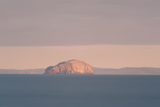 This is the original shot from the Bass Rock this morning, taken from Dunbar. It's ok but there are a few things I don't like about it. First, it's a bit flat which is due to low contrast. In other words, the dark bits are a bit too light and the light bits are a bit too dark. This is easily fixed by raising the contrast level slightly.
Also it's not exactly straight and also something that annoyed me is that the cloud bank to the right is sloping up the way and I wanted that to be a straight line which would make the "layers" of the sea, land and sky look a bit more pleasing. Rotating and skewing the shot fixed this.
I also think that the colour is a bit bland so a boost in either saturation or vibrancy makes the shot a bit richer.
Finally, I didn't like the composition. The Rock wasn't in quite the right place to make the shot jump out of the screen so I cropped it slightly to improve this.
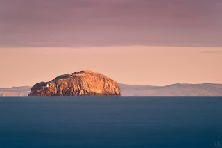
I'll not bore you with further details, suffice it to say that playing around with even the most basic settings in any post processing program can make all the difference in the final result...
In fact, if I didn't have light room then PSE would do me just fine for the basics and a couple of years ago this is all I was using.
Anyway, here are two shots taken this morning and I've only made a few basic adjustments to them, but I wanted to show you what a difference a bit of post processing can make.
 This is the original shot from the Bass Rock this morning, taken from Dunbar. It's ok but there are a few things I don't like about it. First, it's a bit flat which is due to low contrast. In other words, the dark bits are a bit too light and the light bits are a bit too dark. This is easily fixed by raising the contrast level slightly.
 Also it's not exactly straight and also something that annoyed me is that the cloud bank to the right is sloping up the way and I wanted that to be a straight line which would make the "layers" of the sea, land and sky look a bit more pleasing. Rotating and skewing the shot fixed this.
I also think that the colour is a bit bland so a boost in either saturation or vibrancy makes the shot a bit richer.
Finally, I didn't like the composition. The Rock wasn't in quite the right place to make the shot jump out of the screen so I cropped it slightly to improve this.
I'll not bore you with further details, suffice it to say that playing around with even the most basic settings in any post processing program can make all the difference in the final result...

Subscribe to:
Posts (Atom)